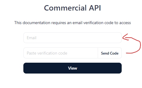
Hey there. Love the product. One minor UX suggestion that is pretty annoying and trips up my users. The placement of the “Send Code” button is in the wrong spot.
If you think about the form semantically, the way the form appears, seems to be:
Enter Email
Wait for Code
Press button to the right of the code input.
I think for the correct UX workflow, “Send Code” should be to the right of the email input. OR. To the left of the send code field.
When I share my docs link, I always explain to the user the process now, because I had a few users telling me ‘the code never arrived’. This was because they were typing in their email and waiting.
It’s not ideal when sharing the docs link and then needing to give a big pre-amble on how to actually log-in